There's Reason to Start Using EM
13 min read time
17 Sep 2022
A look at how dynamic units have benefits over pixels, and how they can significantly reduce cost.
![]()
In the beginning of computing, the act of displaying graphics on a computer monitor was a relatively simple concept. Monitors would have a predefined number of square-shaped pixels that could be displayed on a screen, and computer programs would decide when and how those square-shaped pixels should be shown. This constituted the foundation for how computers could display text, buttons, images and other visuals to the user.
Since then, both computers and monitors have gotten more powerful. Where a '90s monitor might've been able to display a grid of 640x480 pixels at most, present-day monitors can display many millions of pixels.
Contemporary displays now have such high resolutions that the human eye is barely able to discern the individual pixels, or their sharp edges. Because of this, designers don't have to concern themselves as much with whether the shapes that they are drawing using these pixels look smooth.
These improvements in graphics rendering has necessitated new ways to think about drawing pixels on the screen, and that is where dynamic units come in.

Over little more than a decade ago, web browsers gained support for something called "dynamic units". iOS- and Android apps soon followed suit, and also received dynamic units.
Dynamic units are like pixels, except they scale up- and down depending on the size of your monitor. This means that 1 dynamic unit might be drawn using 1 pixel on a 640x480 pixel monitor, while the same dynamic unit might be drawn using 10 pixels on a hypothetical 6400x4800 pixel monitor.
Many - if not most - designers and developer are either unaware of how dynamic units work, or they fail to see its relevance. However, dynamic units can be a significant time- and cost-saving measure for both design- and development organizations, because it allows for the ability to dynamically scale content with little- to no effort.
How pixels are used today
Many designers and developers tend to think in terms of pixels. In organizations, a common workflow between designers and developers is for the designers to create images for every variant of every view that is supposed to be implemented by developers, and for the developers to transpile these images into code. A follow-up is then usually made at one- or several points throughout the implementation process, in order to determine whether the views have been correctly implemented.
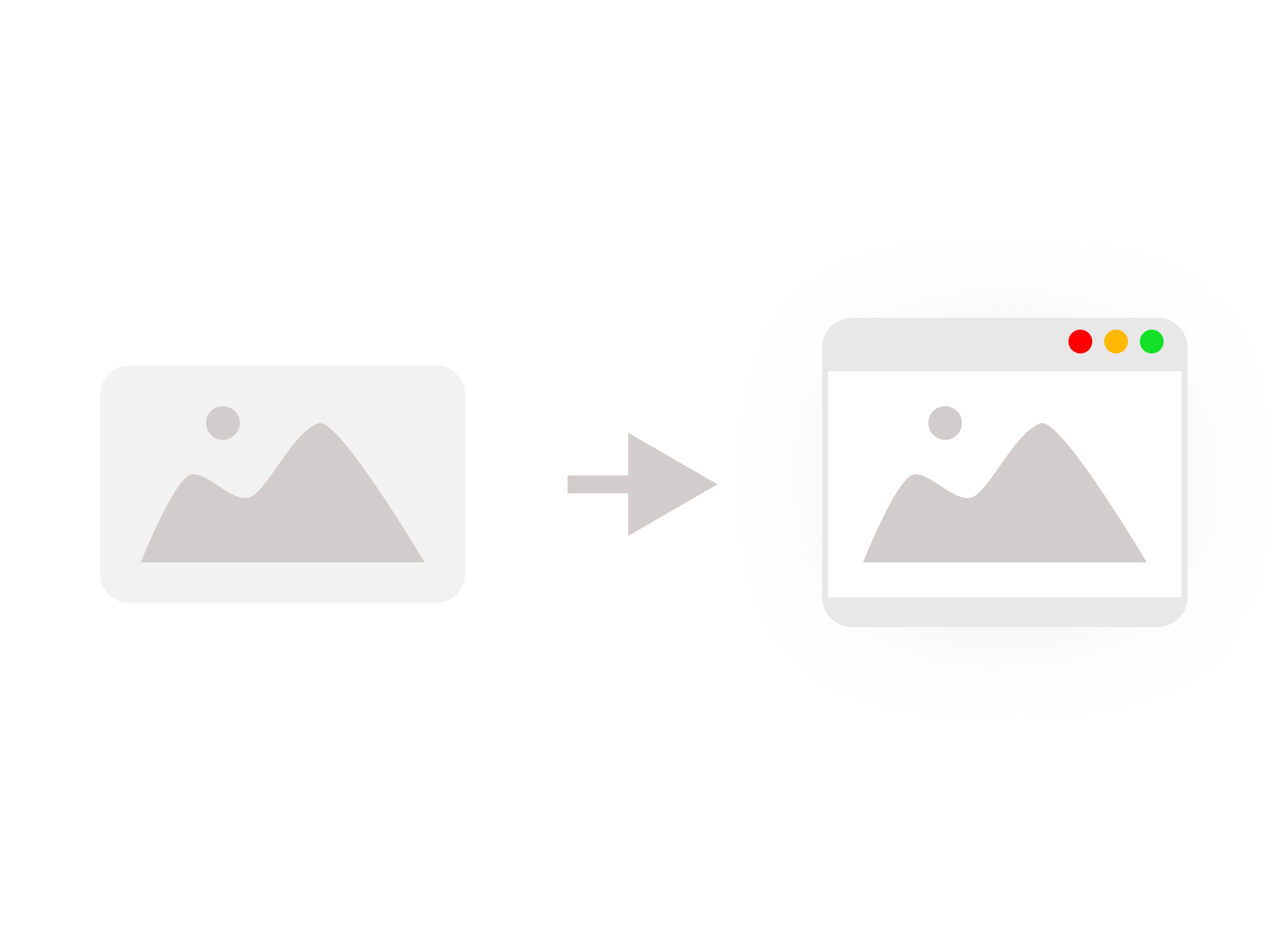
The issue with this workflow is twofold:
First, a static image does not translate well into a digital screen. Whether it's a website or a native application, there are always circumstances where the size of the designed images won't correspond to the user's screen resolution. A good example of this is the commonly-used "Display Zoom" feature on iOS, which increases the size of everything on-screen. With this setting turned on, most image-based views will break. In addition - if the view being designed is for a web page, then it can almost always be assumed that the user's browser window size isn't going to correspond with the exact image resolution that the designer has designed for.
Second and perhaps most importantly though, having to create designs for every variant of every view, for every screen orientation and for every screen resolution on every device is an effective workload multiplier. Even with clever development methods where components are changed dynamically or used selectively, an organization that opts for pixel-based design- and front-end will have to maintain an almost unsustainable amount of views. Because of this, organizations have to choose between either delivering low-quality user experiences or scaling up their design- and development organizations significantly.

Unbeknownst to many organizations, dynamic units can help solve these issues.
The benefits of dynamic units
Dynamic units solves the issue of incrased workload, because the designs- and the front-end scales automatically. Just like how a dynamic unit will be 1 pixel on a lower resolution and 10 pixels on a higher resolution, so will designs created with dynamic units scale up naturally on larger resolutions.
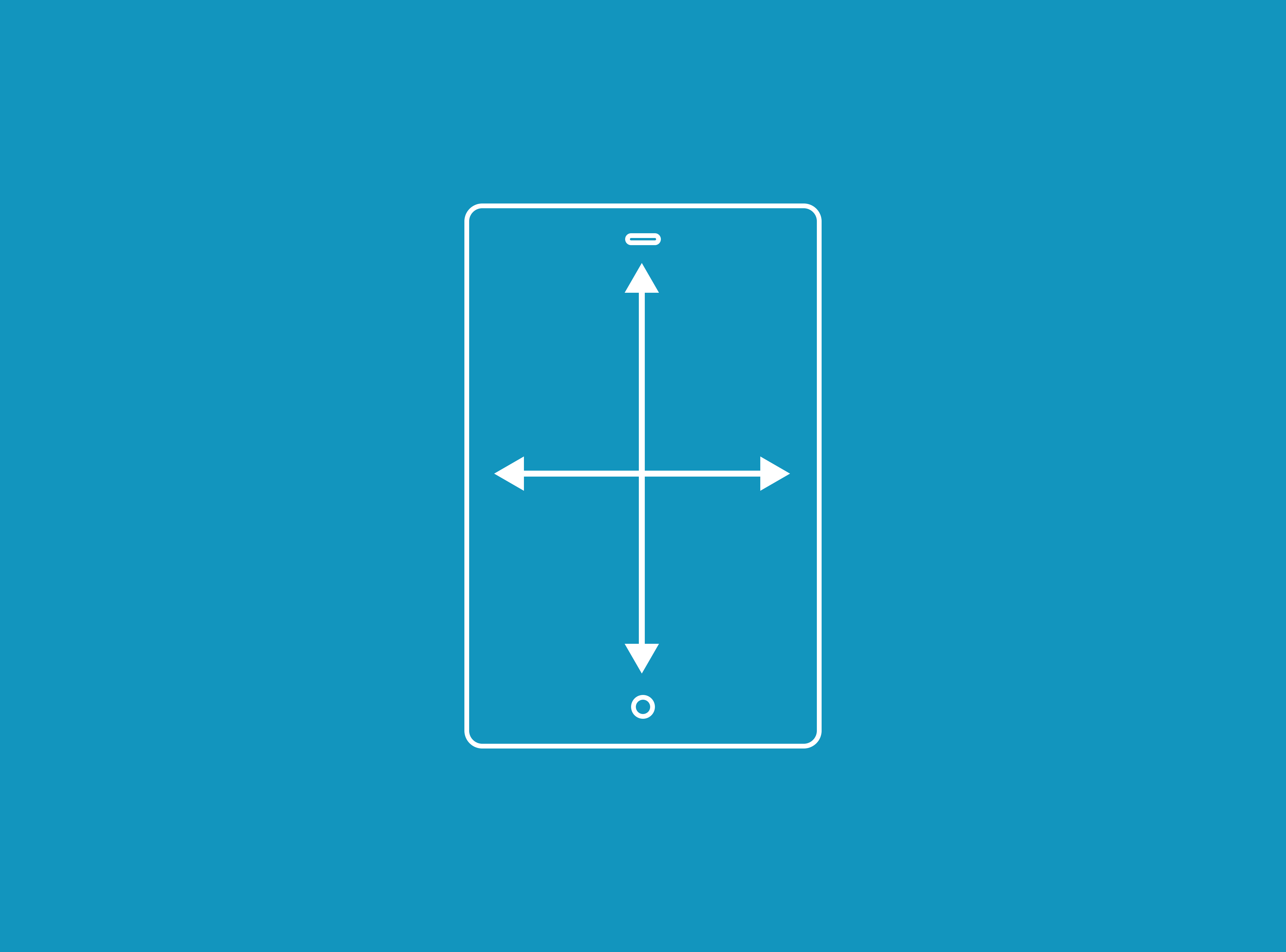
This means that designers and front-end developers only have to think in terms of "aspect ratios" (i.e. the proportions of the screens) instead of number of devices and screen sizes. In other words, an organization could get away with having simply one design for handheld devices, and one design for tablet and desktop. No additional variants would be required, because the views would scale up- and down naturally to fit every device and every screen.
In such a scenario designers would maintain one set of views for all handheld devices, and one set of views for tablet- and desktop devices. Meanwhile on the development end, developers would implement both sets of views using dynamic units such as "em" and "vm" in order to handle the scaling. For native iOS and Android apps, so-called "density-independent pixels" would be used instead of the "em" unit that is commonly used on websites.
This approach has significant benefits:
- The amount of views that the designers need to design- and maintain are significiantly reduced.
- The amount of views that the developers needs to build- and maintain are significantly reduced.
- Design handover and its related discussions are made simpler, because the scope of working with views is reduced.
- Bugs related to improper scaling - such as the iOS Display Zoom issue - are significantly reduced.
- Designers- and developers don't need to pay attention to automatic compensatory scaling adjustments done by target devices.
- Dynamic units can be used in conjunction with user-controlled page zoom for accessibility reasons - just like with regular pixels.
Beyond the above mentioned points, a simpler workflow means that designers- and developers can work together more efficently as well. Because they'll have a common language for working with size and proportions, there'll be fewer points of friction between designers and developers. Handover discussions will be simpler, and there'll be a reduced need for designers to conduct quality control once their designs have been implemented.
Rolling back to pixels
If at any point an organization should choose to revert back to using pixels after having implemented dynamic units, this can easily be done by merely reducing the root scaling factor that causes the dynamic units to scale up- and down. This means that even though the views might be built using dynamic units, those dynamic units can be made to behave like regular pixels at any point by simply turning off their scaling.

This is actually yet another reason why dynamic units are helpful - because even if an organization wishes to manually design- and implement all the device variations for every single view, they can still do so using dynamic units. The only difference in that scenario is that the dynamic units are made not to scale.
When the scaling has been turned off, dynamic units can safely be used as regular pixels. However, if an organization should at any point decide that they need to scale all the views up- or down - then they can do so instantly for all of the elements rather than having to manually go through and changing every instance of every pixel measurement.
This essentially means that dynamic units are backwards-compatible with pixels, because the dynamic units won't actually scale until their scaling has been activated. An organization can still work with dynamic units the way they have always worked with pixels, with the only difference that they can choose to enable dynamic scaling for either parts of- or entire views.
Why aren't dynamic units more common?
Since dynamic units are an abstraction layer on top of pixels, it requires first knowing about pixels before learning about the abstraction layer. It's only natural that people would stop at learning about pixels, since knowing about pixels is the base requirement for being able to self-sufficiently work with design or front-end.
Learning about dynamic units does require making an effort, but luckily it's a simple concept that doesn't take long to master. For some front-end developers the concept isn't necessarily new, since some front-end frameworks offer some variant of dynamically-scaling units.

Ultimately working with dynamic units is a fairly inexpensive investment, because it can be phased in- and phased out without any up-front refactoring or downtime. If an organization wishes to start experimenting with dyanmic units, then a suggestion for a first experiment could be to work on implementing dynamic units in an isolated view that doesn't have too much crossover with other views.
If the experiment succeeds and dynamic units are determined to be a net positive for the organization, then dynamic units can slowly be phased into the front-end on a per-component basis. Once all of the components have been refactored to include dynamic units, scaling can then be enabled which in turn would cause those components to dynamically adapt to the user's screen size.
For any organization that wishes to learn more about dynamic units and how to go about implementing them, hopefully this guide can serve as an informative starting point. For more information, a suggestion might be to read up on "em", "rem" and "vm" in CSS, and "proportional" and "dynamic" units in design tools like Figma or Sketch.
Share this story
Did you like this story?
I write these articles in order to try to provide inspiration, insights and perspectives for UX practictioners and non-UX practictioners alike. If you think that this article was of value to you, feel free to share it with others.


